
BookIsh
Designed for readers of all kinds—whether avid book lovers, book club members, or casual readers—seeking a seamless way to organize their reading journey and discover new books.

Project Overview
PROBLEM STATEMENT
As an avid reader, I often find it challenging to track my books and reading habits, discover personalized recommendations, and easily manage my to-be-read (TBR) list in a single, user-friendly space. GoodReads is the most popular platform for book tracking and review features, however, I find it lacks intuitive navigation and the personalized functionality I seek.
SOLUTION
By focusing on a streamlined UX/UI, BookIsh aims to meet the needs of modern readers, offering enhanced usability and new features that existing platforms have overlooked.
ROLE
UX/UI designer, UX researcher
TOOLS
Figma, FigJam, Adobe Illustrator
Research
I began with some secondary research to gain a better understanding of the problem I’m trying to solve. I looked into market competitors and built some provisional user personas based on the information I found.
I then conducted surveys and interviews to learn more about what readers are looking for in their ideal book-tracking app. These methods helped me uncover key pain points, such as the difficulty of discovering personalized recommendations and the need for better organization tools, as well as opportunities to create a more engaging and user-friendly experience.
TARGET AUDIENCE
Understanding the target audience for BookIsh involved identifying the needs and behaviors of readers of all levels and interests. This ranges from those who enjoy occasional books to those who consume multiple books a month and seek advanced tracking tools. These users share a common desire for an intuitive, personalized platform to track their reading progress, discover new books, and connect with a community of like-minded individuals.
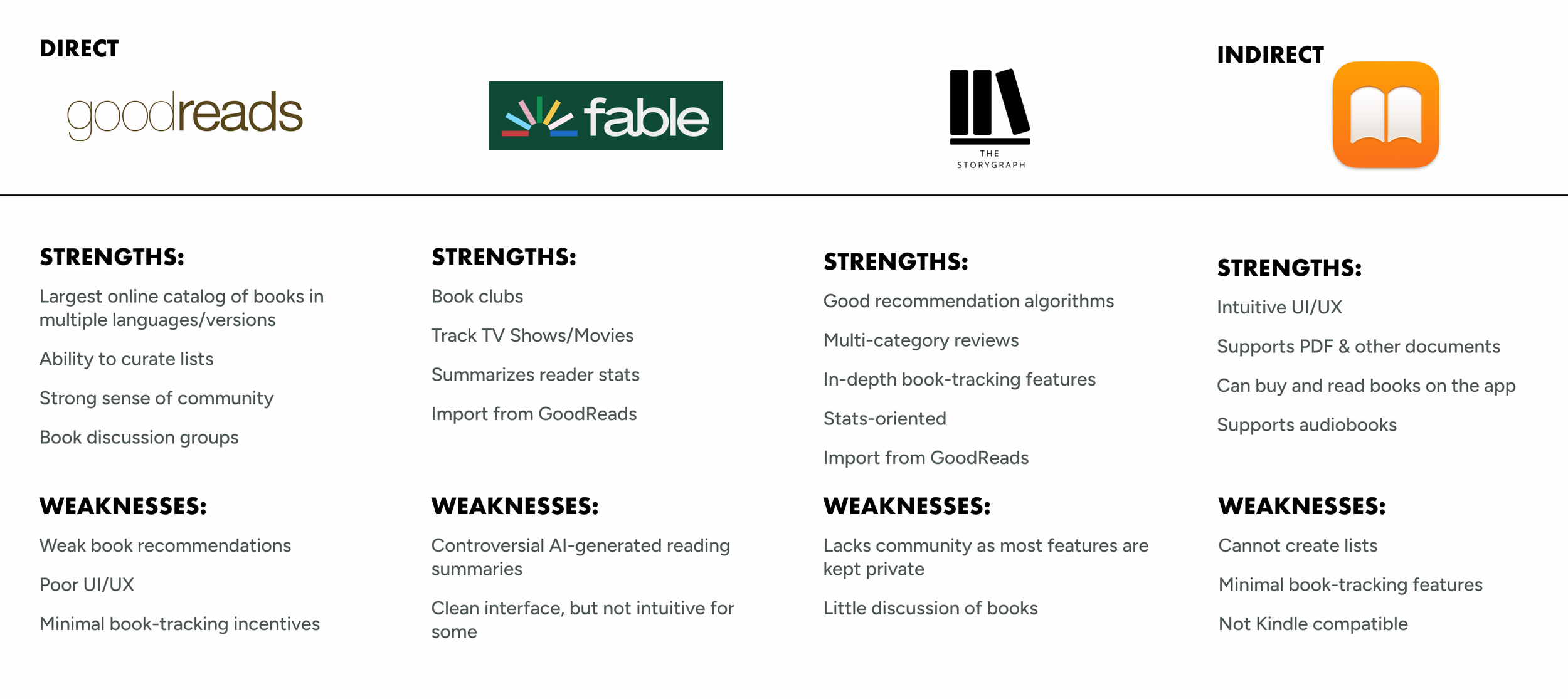
COMPETITIVE ANALYSIS
To better understand the current market and identify opportunities for improvement, I conducted a competitor analysis focusing on both direct and indirect competitors. This analysis highlights the strengths and weaknesses of existing platforms, such as Goodreads and Fable, and provides valuable insights into how my app can address gaps and deliver a more engaging user experience.
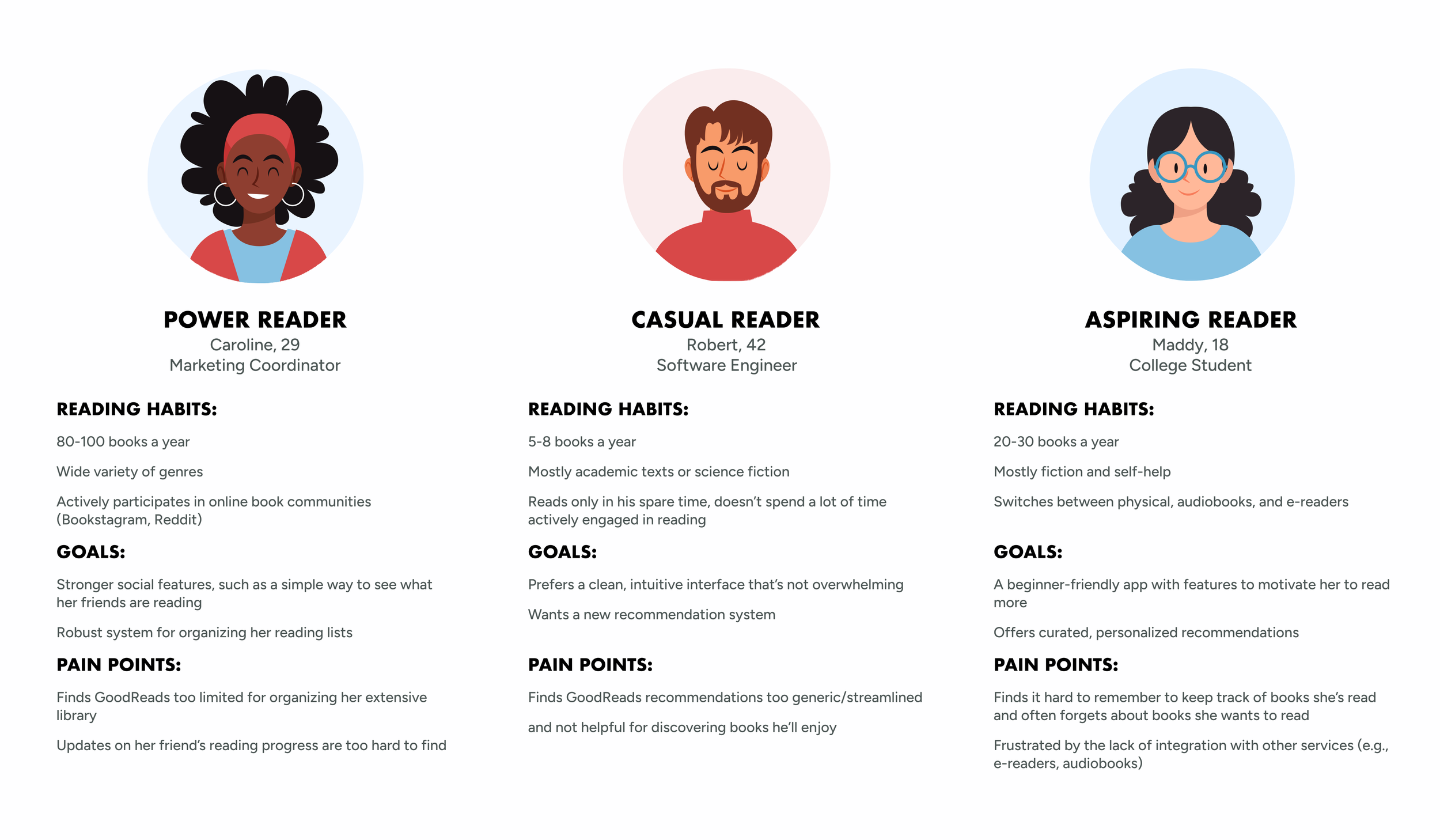
PROVISIONAL PERSONAS
To start getting an idea of who BookIsh’s users are, I gathered everything I’ve learned so far and created 3 provisional personas. These personas represent key user groups: the casual reader, who enjoys occasional reading and seeks simple organization tools; the power reader, who devours books and values detailed tracking; and the aspiring reader, who is eager to read more and looks for motivation and community support. These personas helped guide the design process by focusing on the diverse needs and goals of potential users.
USER SURVEYS
To validate my assumptions and learn about experiences of potential users, I conducted user surveys with approximately 30 participants who aligned with the three provisional personas. The surveys focused on uncovering reading habits, pain points with existing tools, and desired features, providing valuable insights to inform the app’s design and functionality.
From the survey, I gathered:
The target audience is frequent readers (11-25 books/year), but are also the readers who care less for the more specific features, such as stats or journaling
The readers who read the most books in a year, however, do strongly value these “extra” features
Most readers find their book recommendations through social media (BookTok, BookTube, etc.) and through recommendations from friends/family.
Nearly everyone checks a book’s ratings/reviews before reading a book.
Majority of readers who do track their reading does so through an app (GoodReads, Storygraph, etc.), with few who use a journal to physically track their reading.
Most readers highly value an intuitive interface and personalized recommendations
Nearly all readers don’t write reviews for the books they read
Readers do not prioritize an app that can link their reading to other forms of social media
All readers are interested in curated reading lists based on their past books
USER INTERVIEW
After analyzing the results of the user surveys, I conducted one-on-one interviews with two survey participants, one who matched the casual reader, and the other who matched the power reader. These interviews allowed me to explore their reading habits, frustrations with current tools, and specific features they would find valuable. The detailed feedback helped uncover nuanced needs and shaped more targeted design decisions for the app.
“I mostly want a place to track the list of books I want to read because I’m never able to remember, especially since I’m not consistently reading.“
-Amy, the Casual Reader
“I guess I just feel like I’m constantly seeing recommendations for books that don’t match the genres I read. Like I keep getting recommended the ACOTAR series even though I never read Fantasy.“
-Sophie, the Power Reader
Define & Ideate
After conducting and analyzing my research, I moved to translate my findings into actionable design goals. I developed a user persona to represent the user voices heard during my research. From there, I began compiling the problems we are trying to solve for the user.
Next, I defined how a user would interact with the app and how the app would be laid out.
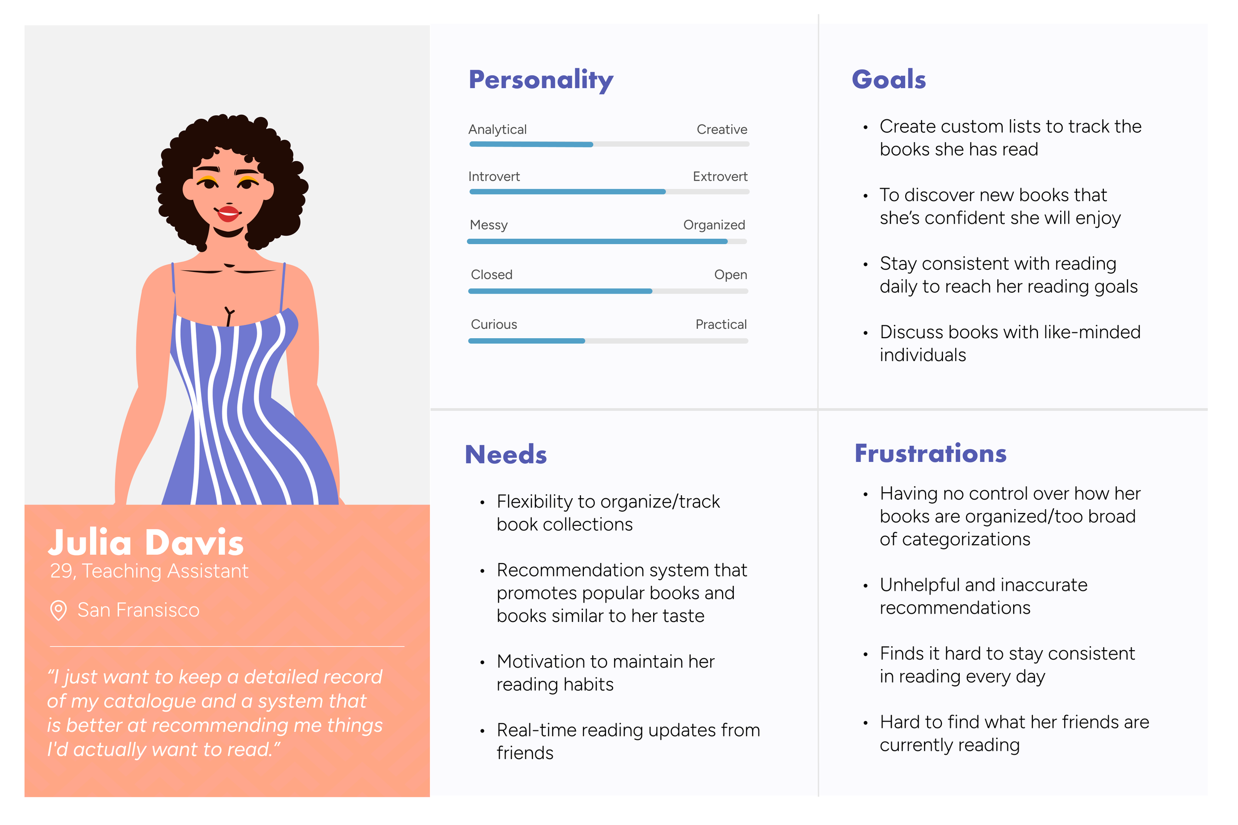
USER PERSONA
Following the research phase, I wanted to ensure that every decision in the design process stayed grounded in a user-centered approach. To achieve this, I developed a user persona that encapsulates my target audience. This persona serves as a guiding reference throughout the project, helping me make design choices that align with real user needs and behaviors. Let me introduce you to Julia!
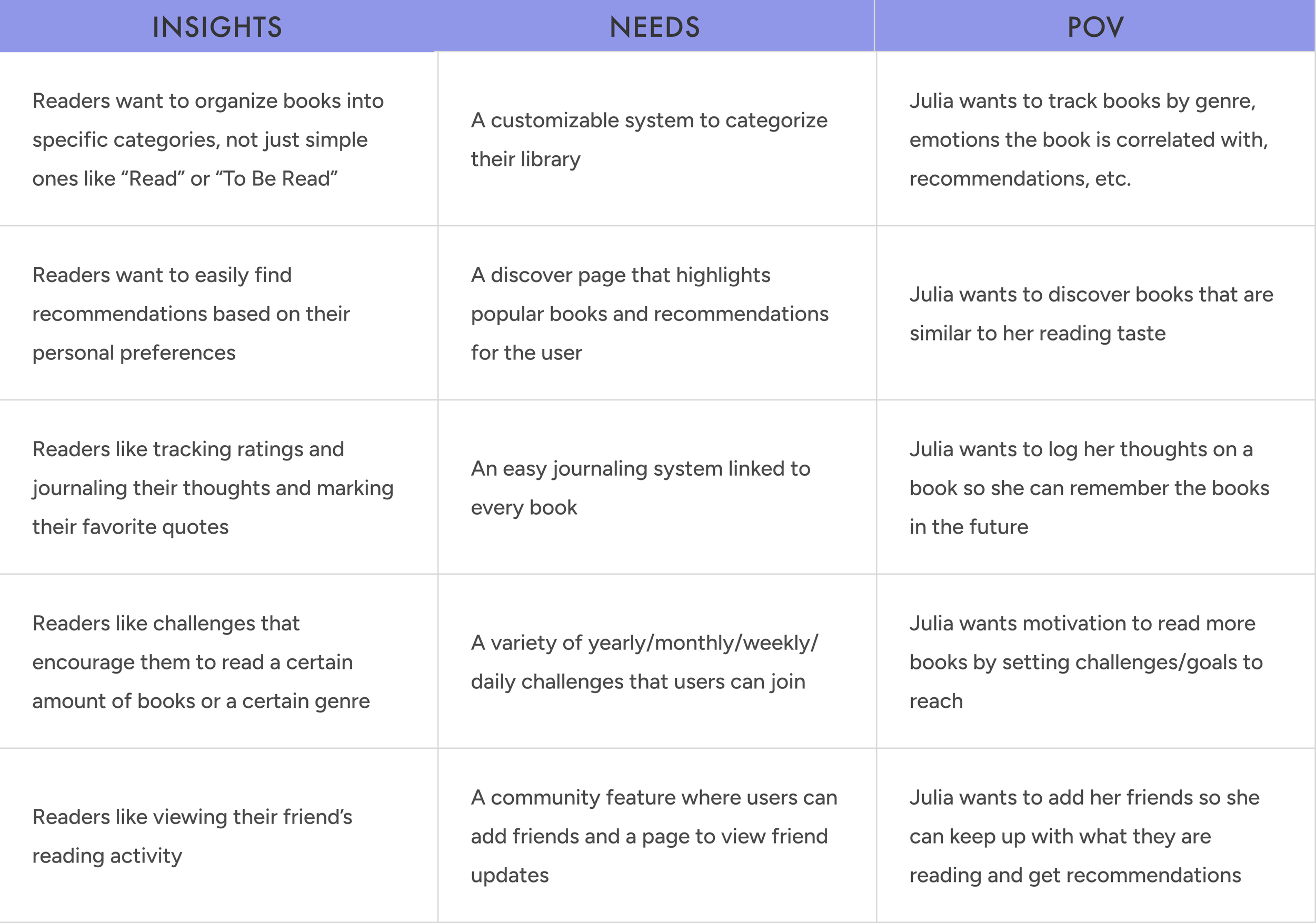
DEFINING THE PROBLEMS
Now, with a clear understanding of our user, Julia,I wanted to start compiling the problems I intended to solve for her. To do this, I crafted detailed point-of-view (POV) statements that highlighted her perspective and framed her core problems. These statements served as a foundation to guide my brainstorming process, ensuring that the solutions I explored were both relevant and user-focused.
BRAINSTORMING
After defining the user needs, I created a mind map to quickly record as many ideas as possible for each problem.

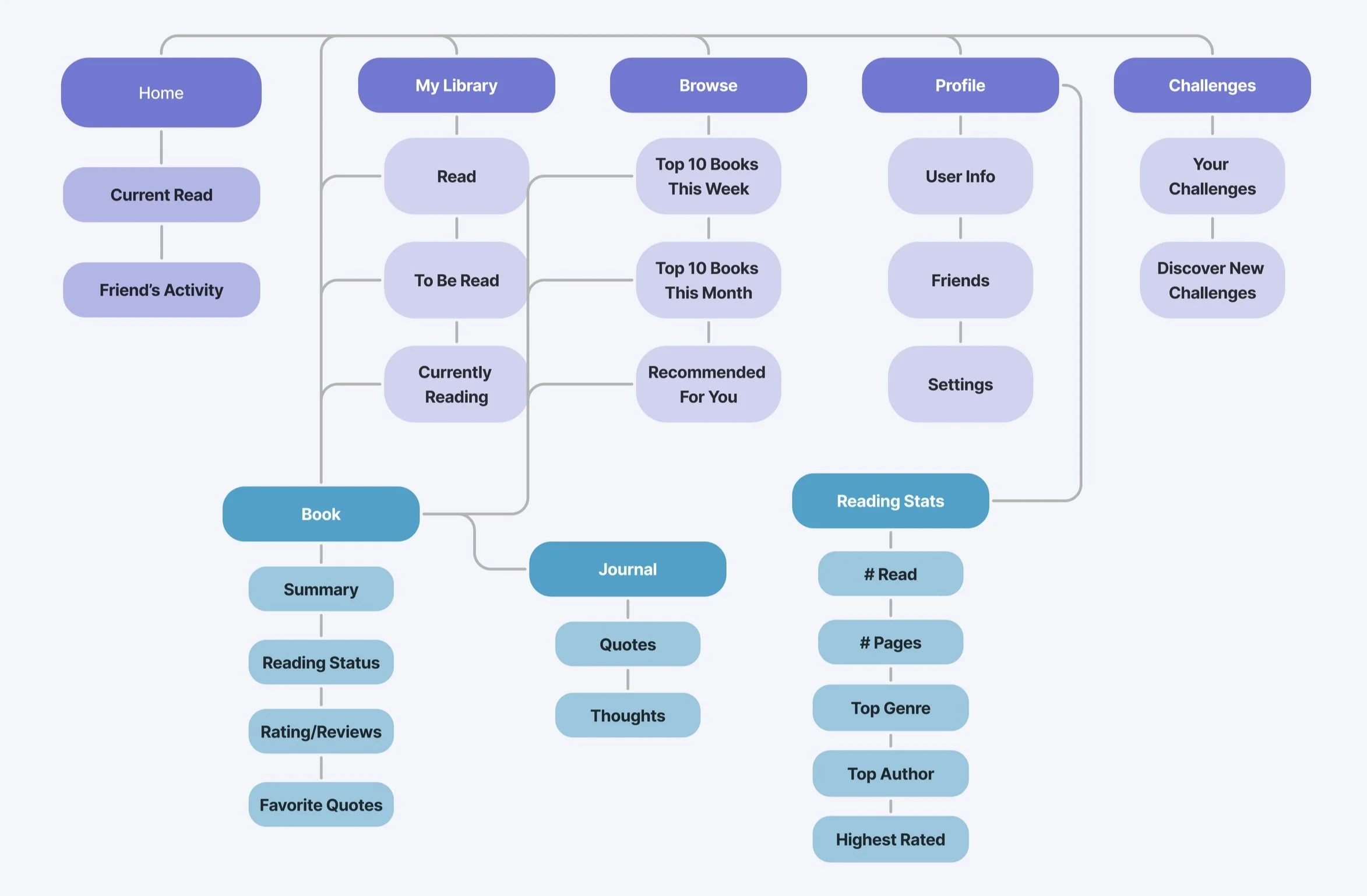
SITE MAP
To start planning the architecture of the app and deciding how the features would fit into it, I created a site map to structure the screens in an intuitive and user-friendly way. This process helped me visualize how users would navigate through the app, ensuring a logical flow between features and minimizing friction.
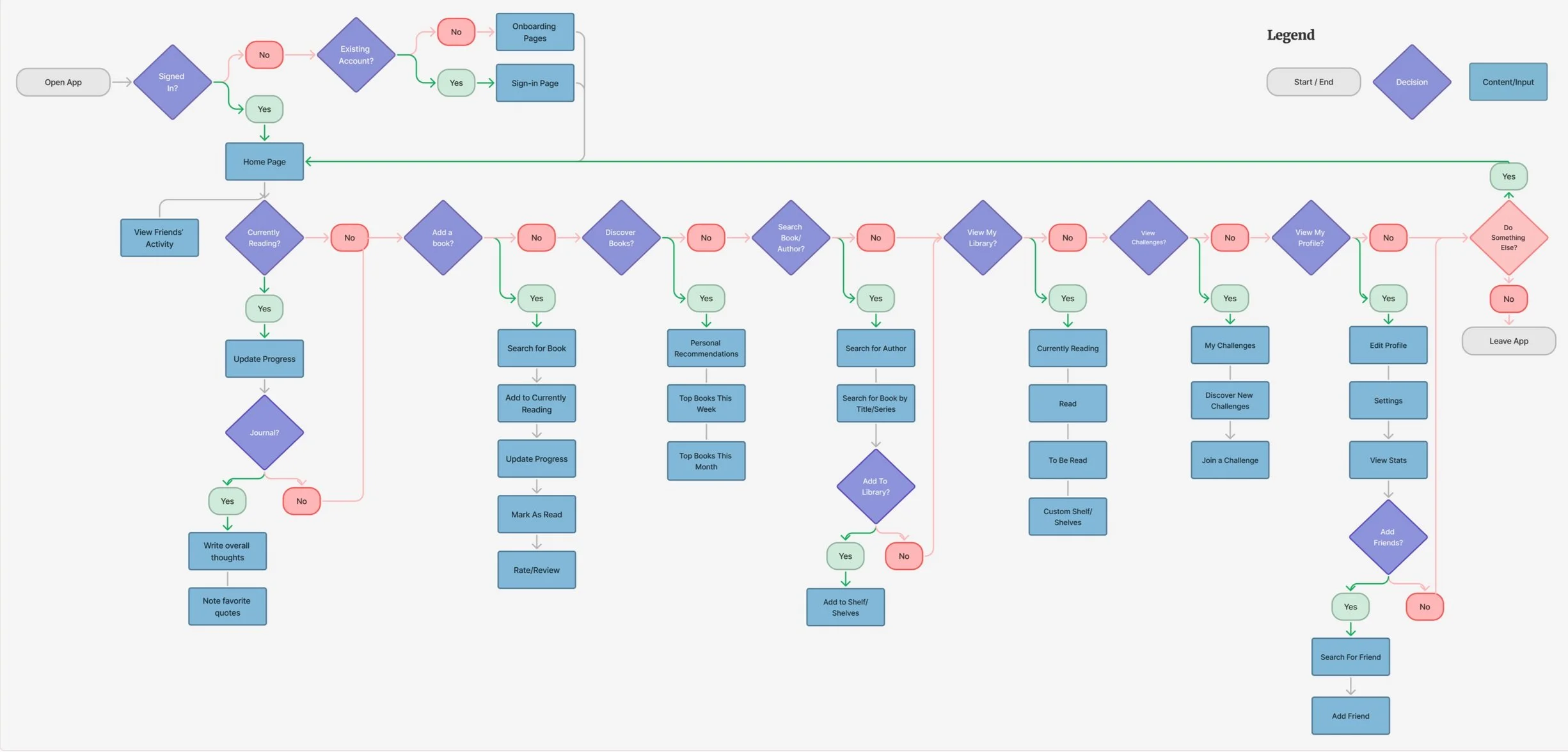
USER FLOW
After planning the organization of the screens, I dove deeper to get a better understand of the overall user interaction with the key features of the app. I considered different decisions users may take and the different paths the user could take to complete the task.
LOFI WIREFRAME SKETCHES
After developing my understanding of the user, my goals, the architecture, and the interaction with the app, I started drafting BookIsh’s screens with low-fidelity wireframe sketches.

Design and Prototype
After gathering initial ideas and sketching the app’s features, I began refining my designs on Figma.
MID FIDELITY WIREFRAME & PROTOTYPE
With the app's structure and features defined, I moved on to creating mid-fidelity mockups to bring the design to life. These mockups focused on layout, with limited functionality and navigation, providing a clearer representation of how users would interact with the app.

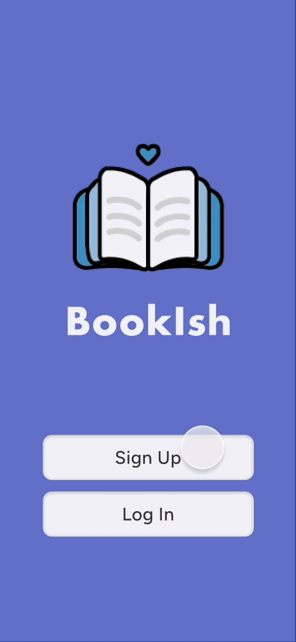
DESIGN
To ensure consistency and cohesiveness throughout the app, I developed a design/UI kit for BookIsh. This kit includes the app's icons, color palette, logo, and typography, all thoughtfully chosen to reflect the brand's personality and enhance the user experience.

PROTOTYPE
With the mid-fidelity mockups finalized, I created an interactive prototype to demonstrate how users would navigate and interact with the app. This prototype allowed me to bring the design to life, simulating the user experience and providing a platform for usability testing and feedback.
Onboarding Process
As a user signs up for BookIsh, they are able to select the genres they prefer reading, as well the ability to pick their favorite books, to start receiving tailored recommendations as soon as they begin using the app.
Additionally, readers are able to set their reading goal for the year to start their first challenge.

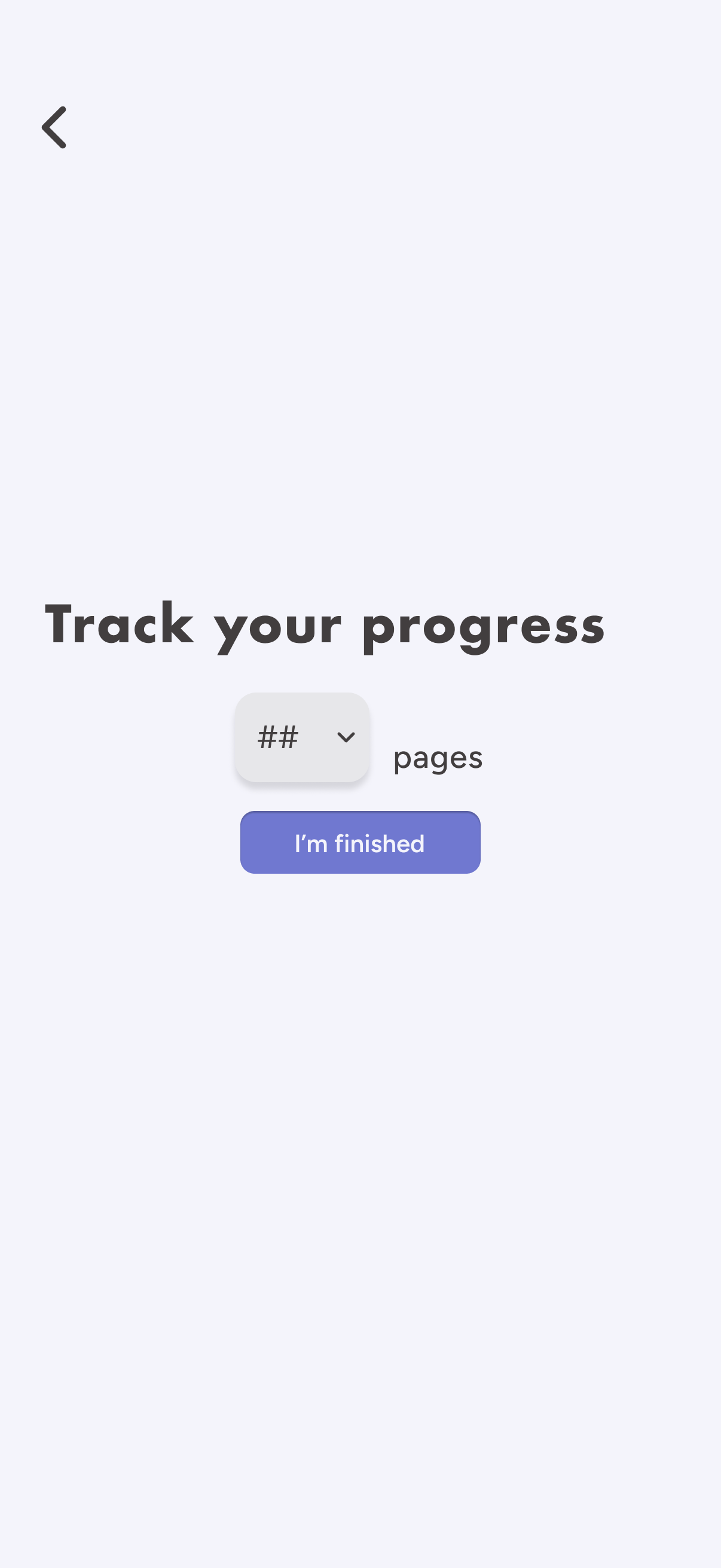

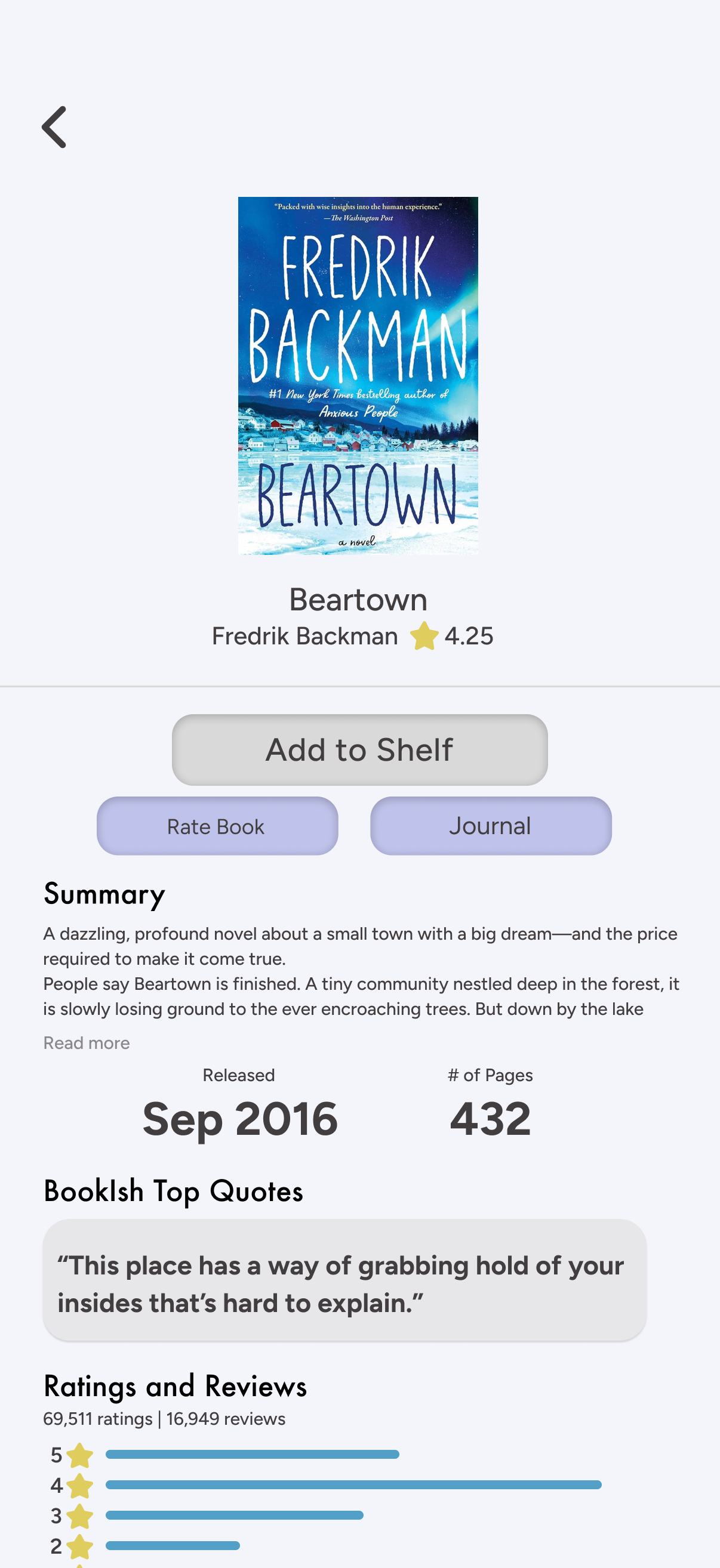
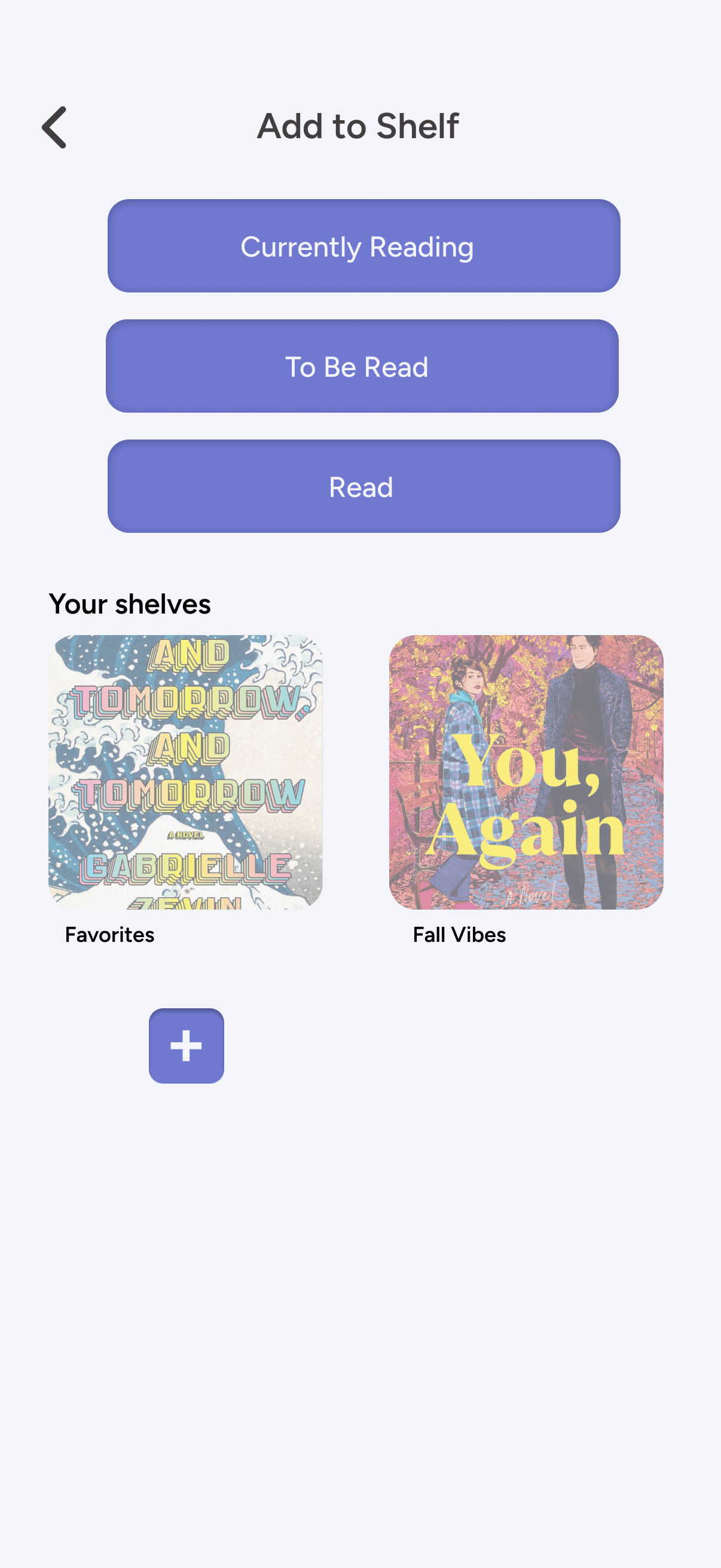
Process of adding a book to a shelf and its updated status, as well as the interface for tracking reading progress and rating/reviewing a book

Testing
TEST 1
TASK
You just finished reading “Happy Place” by Emily Henry. Mark it as “Read” and leave a rating and/or review.
RESPONSE
There were no issues with completing this task. Users noted it was fairly simple given that the first item listed on the home page is the book that is currently being read, with an “Update” button taking them straight to the screen where they can mark a book as “Read.”
TEST 2
TASK
You have been feeling unmotivated to read, so you decide to start a challenge. Your friend tells you that she’s recently joined the A-Z challenge and suggests you try it as well. Find the challenge and join it.
RESPONSE
Some users were unable to locate the challenges page, and most of those who did, mentioned that they had to click around a couple times to find it. It is one of the five tabs linked on the bottom navigation bar, however, it is hard to tell which icon links to the challenges unless process of elimination is being used.
I have since changed the icons to be labeled to minimize confusion.
TEST 3
TASK
You marked “Dance of Thieves“ as “Read” yesterday, and today you’ve finally gathered your thoughts on it and are ready to write a journal entry to express your thoughts. Navigate to the journal page for “Dance of Thieves” and post your entry as a review.
RESPONSE
Most users were able to complete this task as they noted they found a few ways to navigate to the journal. Most users went to their “Read” shelf, located the book, and clicked “Journal” found on the Book Info page. Some located the “My Journal” button on the profile page and found “Dance of Thieves” through there. Everyone who was able to navigate to the page were able to click “Post.”
Those who were unable to complete the task had assumed the page would be linked in the navigation bar.
TASK COMPLETITION RATE
100%
TASK COMPLETITION RATE
70%
TASK COMPLETITION RATE
90%
Reflection & Next Steps
As this is my first full case study—from research to wire-framing to prototyping—I had a lot to learn throughout the process. At the end of it, I have gained valuable skills in conducting research and improved my proficiency with tools like Figma and Adobe Illustrator.
The design process is an ongoing one, as there is always room for improvement. After creating the initial prototype and running a few simple usability tests on users, I am now focused on iterating on the design of BookIsh. My next step is to implement the changes based on the feedback from testing, as well as prototyping every available action BookIsh offers.